A personal website, not an event listing
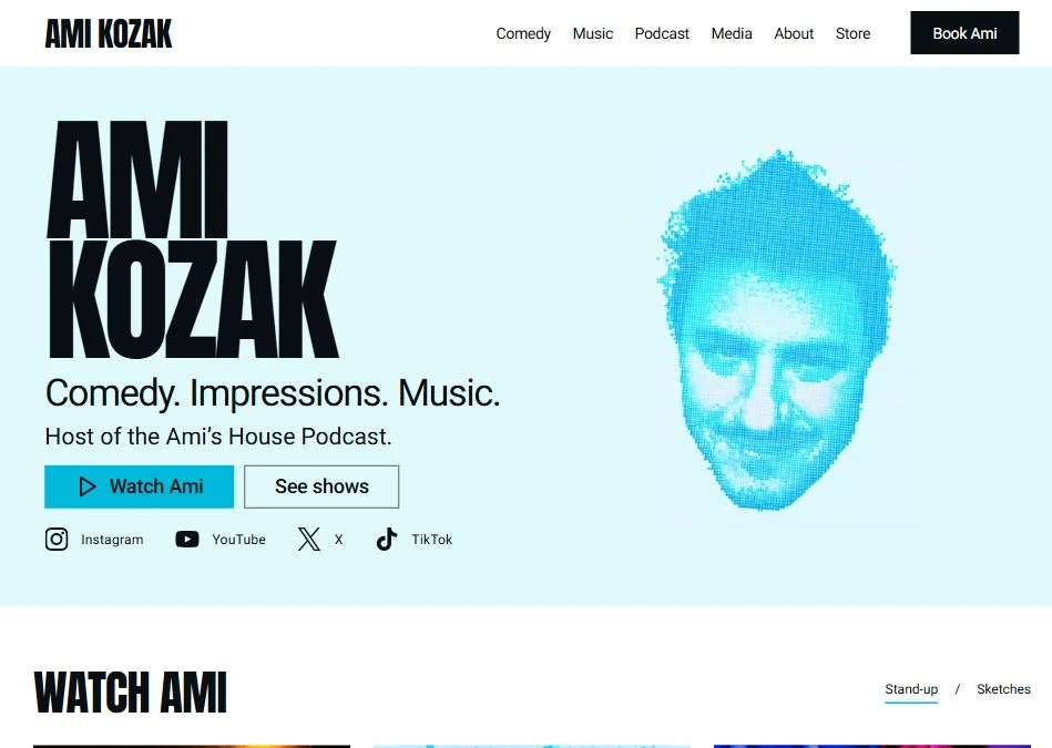
The main heading is the performer’s name, set in heavy condensed black lettering. Under it, “Comedy. Impressions. Music.” explains the act in three words, followed by a separate line identifying the Ami’s House Podcast. This is a useful order for a visitor arriving from a clip: identify the person first, then explain the range of work.
The site’s job differs from a comedy venue’s site. Someone looking for Ami may want to watch him, find a show, listen to the podcast or arrange a booking. Those are different tasks; a single ticket button would leave most of them unanswered.
What the first screen does
The pale cyan background and halftone portrait give the introduction a recognisable visual treatment without placing small text over a busy photograph. The portrait occupies the right side of the desktop layout; the large name anchors the left. Black lettering carries the identity, while cyan highlights the “Watch Ami” action.
“See shows” is a bordered secondary button beside it. “Book Ami” sits separately in the header. That distinction matters: watching is a low-commitment action, show attendance is a scheduling task, and hiring the performer is a different conversation.
How the content is divided
The navigation names Comedy, Music, Podcast, Media, About and Store. Immediately below the introduction, the “Watch Ami” section has Stand-up and Sketches options. The page therefore distinguishes formats twice: broad destinations in the header and a narrower choice inside the watching section.
The social links sit below the two main buttons rather than replacing them. This gives visitors a route to Instagram, YouTube, X or TikTok while keeping the website’s own content and shows prominent.
The trade-off: bold identity versus a crowded menu
The large name and portrait are easy to recognise, but six navigation categories plus a booking action create a real mobile layout constraint. A mobile build needs a short menu with the same destinations, a legible name treatment and enough space for the watching and shows buttons.
The screenshot demonstrates the desktop hierarchy, not mobile usability or booking performance. Those would require testing the relevant screens and collecting actual usage data.