The audience question is answered before the programme
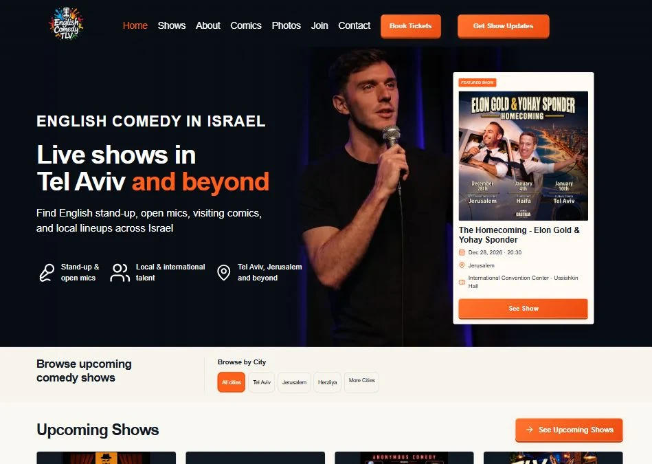
The opening identifies “English comedy in Israel” and says “Live shows in Tel Aviv and beyond.” The supporting line names stand-up, open mics, visiting comics and local lineups. Before reading an event card, visitors know the performance language, the broad area and the kinds of shows on offer.
Three small items reinforce this: stand-up and open mics, local and international talent, and Tel Aviv, Jerusalem and beyond. Geography is functional here; it helps someone decide whether an event is practical to attend.
A featured event carries the booking details
The right-hand featured-show card includes an event poster, title, date, time, city, venue and a “See Show” button. The performer photograph fills the central background, while the light card remains readable against the dark hero. The visual story and the practical booking information have separate spaces.
The event details in the retained image are a snapshot, not a current schedule. The useful pattern is their grouping: a visitor can assess the date and place before opening the event, rather than discovering a venue mismatch after clicking through.
The city filter changes how visitors browse
Below the hero, a “Browse by City” row includes All cities, Tel Aviv, Jerusalem, Herzliya and More Cities. The Upcoming Shows area begins immediately afterward. This puts the broad promise of the heading into a practical browsing structure.
A multi-city programme needs a different homepage from a single venue. If the first screen promotes one Jerusalem event, a visitor looking for Tel Aviv still needs a clear route to the other listings. The city row supplies that route in the captured design.
Two actions serve different stages of interest
The header contains “Book Tickets” and “Get Show Updates.” A visitor ready to attend can go toward tickets; someone whose date or city is not currently available can follow future announcements. The labels are more informative than repeating a generic “Learn more” button.
This also creates a maintenance responsibility. Past events, cancelled shows and changes to venues need to be reflected in the listings. The screenshot alone does not confirm the update system, filter behaviour or ticket handoff.